Data Visualization is such a heavy term and you may plan on hiring a data analyst for it. But the twist is, YOU DO NOT REQUIRE A DATA ANALYST FOR DATA VISUALIZATION. We are sure that you were not expecting this. The truth is that technology has been upgrading regularly. So as a result, we have data visualization tools to decrease the manpower.
We agree on the fact that data analysts can provide stupendous reports and comes up with strategic growth for the company. But if you are looking for someone who can check out all the data and provide the reports of current happening graphically, then these data visualization tools are made for you. We have been shifting to an easier mode of work like e signature, tracking tools etc, so why not understand data on your own. Let’s clear the basic terms first.
What is Data Visualization?
Data Visualization is the graphical or visual representation of the data which includes demographic information, sales, conversions and many more. It is presented in the form of Heat maps, graphs, pie charts, infographics etc.
The information or the data represented with this method is more appealing and easy to understand for any company. It allows them to extract out the points which are working amazingly and which require attention.
People can look for the actionable data and it contributes to making the smart decision. You cannot analyze the growth and other factors of the company without data visualization. Your company can make more efficient real-time decisions which will then lead to the overall growth of the business. Here is the tutorial for Data Visualisation-
For data visualization, you should be able to understand the metrics and insights it has provided about your company and that is all. Here are 8 impressive and worthy data visualization tools to accelerate the growth of your company.
Data Visualization Tools
- Zoho Analytics
- Tableau
- Google Charts
- Sisense
- DataWrapper
- Highcharts
- Power BI
- QlikView
1. Zoho Analytics
Zoho Analytics is one of the most popular data visualization tools which integrates business intelligence and online reporting services. It enables the creation of extensive reports and data in no time. Furthermore, you can customize reports and share them with your team to analyze the numbers.
Zoho analytics or Zoho reports is the part of the Zoho office suite which further includes Zoho sheet, Zoho show and Zoho writer. You can take help from these tools because Zoho is an amazing CRM software too.
Zoho Analytics pros and Cons
PROS
Custom Reports can be made and shared
Consumes less time
Includes email scheduling
CONS
Confusing Dashboard with more data
User Training requires improvement
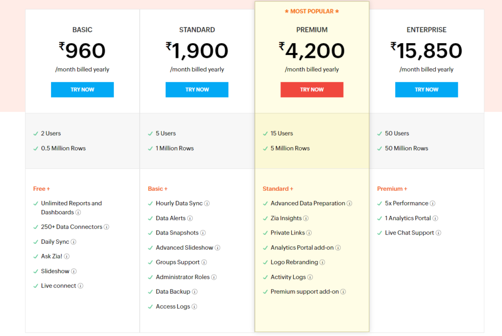
Zoho Analytics Pricing
It has a 15 day free trial without the need for a credit card.
2. Tableau
The position of the most widely used tool for data visualization is grabbed by Tableau. It provides inclusion for an updated database that includes Teradata, SAP, My SQL, Amazon AWS and Hadoop. This tool has the ability to create a visualization from continuously changing data numbers used for AI, machine learning and big data applications.
Tableau Desktop was the main idea which was made for static visualization to publish on one or more web pages. Tableau Public is the tool that is available for use to all with limited features.
Tableau Pros and Cons
PROS
Easy to Use
The visualization system is excellent
Top-notch performance
Supports diverse data sources
CONS
A bit expensive
The auto-refresh option is not there
Can’t report scheduling
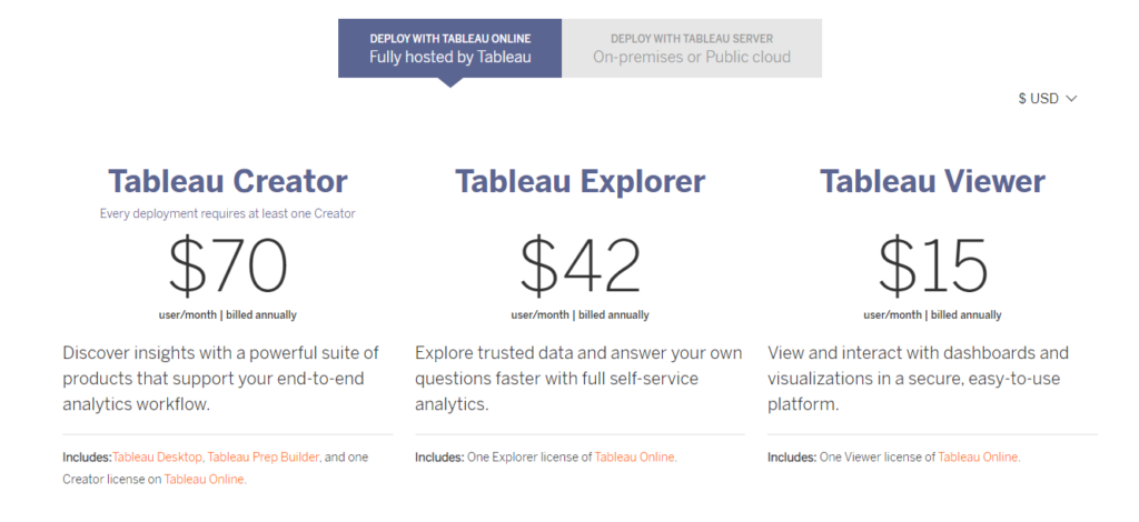
Tableau Pricing
Tableau has a free trial for its users.
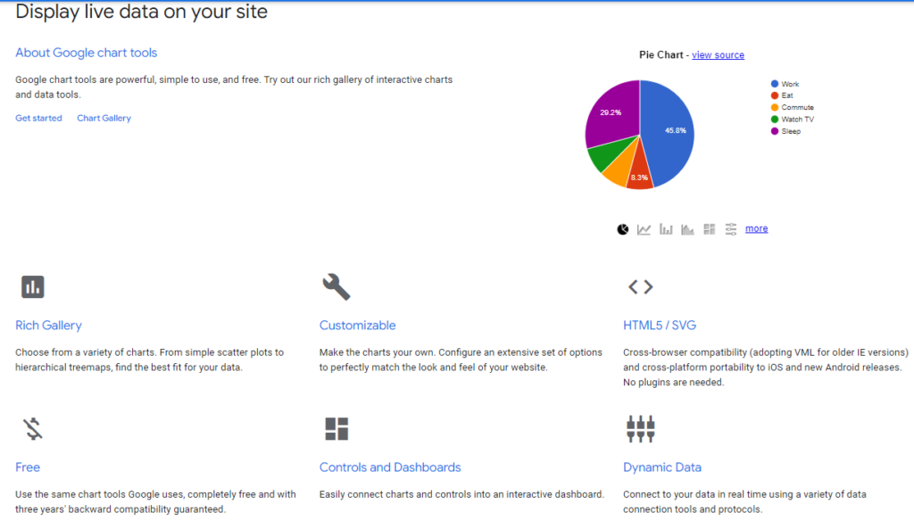
3. Google Charts
Google Charts is the next and free of cost data visualization tools that have gained fame from its pictorial and graphical representations. You can access it even on the old version of internet explorer. Good Charts offers zoom functionality to its users.
Google Charts Pros and Cons
PROS
Data is easy to integrate
Highly Compatible with other Google tools/Software
Graphs and Data are attractive
User-friendly dashboard
CONS
Improvement is required in Customization features
Not required Demo on tools
The option to export data needs changes
Google Charts Pricing
Google charts are free of cost, your company can use them to analyse growth.
4. Sisense
Considered one of the quickest data visualization tools, Sisense analyses all the data and comes with compiled and easy to understand presentation of the insights. It summarises the data and helps the users to target the main point in no time. Furthermore, this tool fits perfectly for big projects that require more data and numbers.
Sisense Pros and Cons
PROS
Trustworthy Interface
Customer Support is exemplary
Seamless Customization is possible
CONS
Time Formats support is not good
Limited visualization versions
Creating and keeping analytics cube is tough
Sisense Pricing
Sisense offers a free trial and the pricing will be provided on demand.
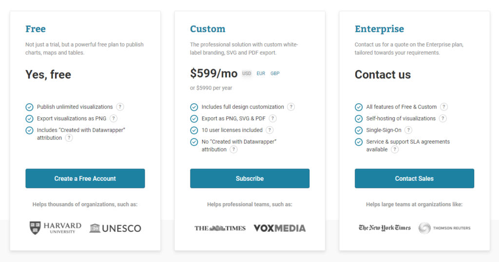
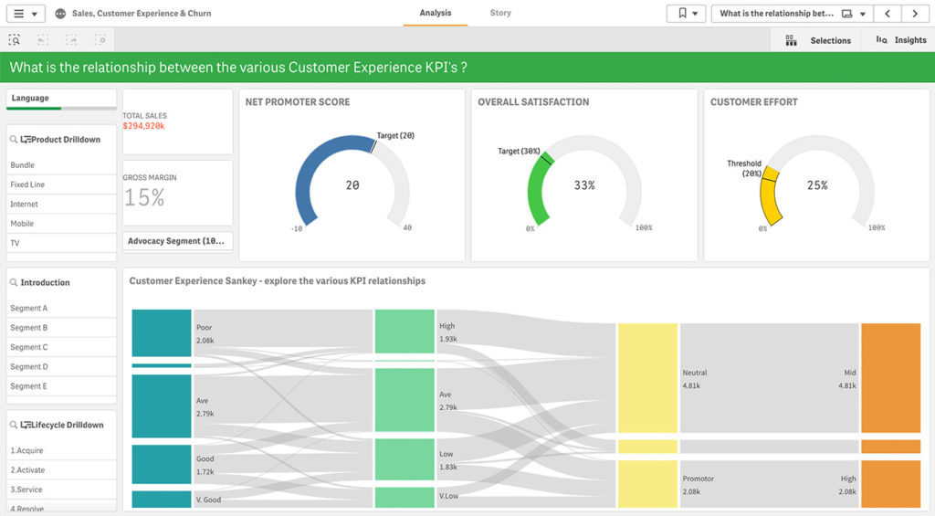
5. DataWrapper
With the clean, easy, interactive and amazing user interface, Datawrapper is used by many multi-billionaire companies. It has the ability to create charts, maps, tables and visual graphics which can be operated and analysed on all devices. It has a good readability system so that the users do not face any issues.
Datawrapper Pros and Cons
PROS
Don’t need to install it to make charts
Easy UI so it fits beginners
The free version is there
The user interface is simplified
CONS
Pricey
The free version has limited features
Creating complex charts like Sankey is tough
Security becomes a hindrance
Datawrapper Pricing
Datawrapper has both a free version and a paid version.
6. HighCharts
Highcharts is running on Javascript API and provides cross-browser functionalities that make it an interactive Data visualization tool. Access to this tool is quite easy which attracts so many companies toward it. Highcharts has been working with top brands like Samsung, Sony, BBC, Twitter and many others.
Highcharts Pros and Cons
PROS
Graphics are very appealing
Multiple options for chart layout
Easy and Flexible
CONS
Doesn’t fit the small companies
Prices are high
Highcharts Pricing
Highcharts has a free trial pack.
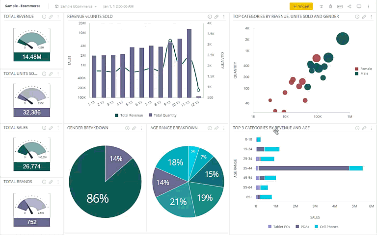
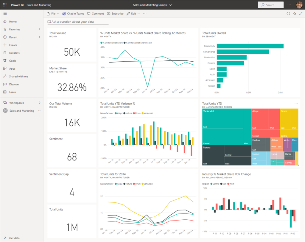
7. Power BI
The complete data visualization tools consist of various factors and Power BI fits in that properly. This Microsoft product is available for on-premise installation and deployment on cloud infrastructure. This tool supports Teradata, Salesforce, Oracle, Google Analytics, Github, excel and many more. The enterprise-level tool creates stunning visualizations and delivers real-time insights for fast decision-making. It is used by some top brands like P&G, Toyota and others.
Power BI Pros and Cons
PROS
Do not require a tech support
Indulge in existing applications and tools effortlessly
Personalization is available
Highly Secure Tool & Simplified Dashboard
Adjusts perfectly with Microsoft products
Speed or memory hindrance is not there
CONS
Can’t manage multiple data sets at once
Power BI Pricing
It has a free trial version for the users and the paid pack starts from $9.99 per user/month.
8. QlikView
In the list of data visualization tools, we have QlikView, which is an amazing and highly responsive tool. It provides correct data without wasting any second. QlikView has the reach of nearly 40,000 clients in over 100 countries across the globe. The key features of QlikView are enterprise reporting, business intelligence capabilities etc.
QlikView Pros and Cons
PROS
Simple and interactive UI
Appealing user interface
Pocket-friendly pricing
Easy maintenance
CONS
Customer support is not appreciated
‘Drag and drop’ feature is not there
RAM limitations
QlikView Pricing
You will get a free trial at QlikView.
Conclusion
The analysis of data and numbers is the obvious way of understanding consumer behaviour. There is always some room for improvement and the data visualisation tools justify that. It collects all the data and turns it into graphical representations like a heat map, tables, graphs, charts etc to make the understanding and visualization easier for the users. It decreases the workload of data analysts as well. It is not exactly a replacement for data analysts but does its job at a smaller level. These are the tools that help you in making a better decision.
Read this article and share your view in the comments below. Also, share your experience if you have used any of these. Contact us, if you have any other amazing data visualization tool, we will analyse it and will surely introduce that to our audience.